Compare.com Redesign
When I joined Compare.com in 2015 as a Senior UX Designer, the WordPress-based marketing site was in urgent need of a rebrand. The color palette and typography lacked visual appeal, and the use of outdated clip-art visuals failed to resonate with the target audience. The existing design did not effectively communicate the company's message or value proposition.
My objective was a comprehensive redesign of the brand identity, focusing on enhancing the user experience, improving conversion rates for quote initiations, and optimizing the site for SEO performance.
view live website- Improve visual experience and usability
- Update the brand to appeal to a more youthful, savvy audience
- Increase quote start rate
- Improve SEO
- Branding: Custom icons, updated photography, color pallette, look and feel
- Increased Quote Starts: Placed Quote Box components in key locations throughout the site
- Improved SEO: Developed key informational pages aligned with the Marketing Department's SEO recommendations
- Led the redesign
- Collaborated with business owners and Marketing to define targeted updates
- Rebuilt the site theme in WordPress (HTML, CSS, PHP)
- 20% increase in quote starts
- Significant improvements in SEO
- Better branding for target users
- Website is currently live
- Company has since been aquired by Insurify
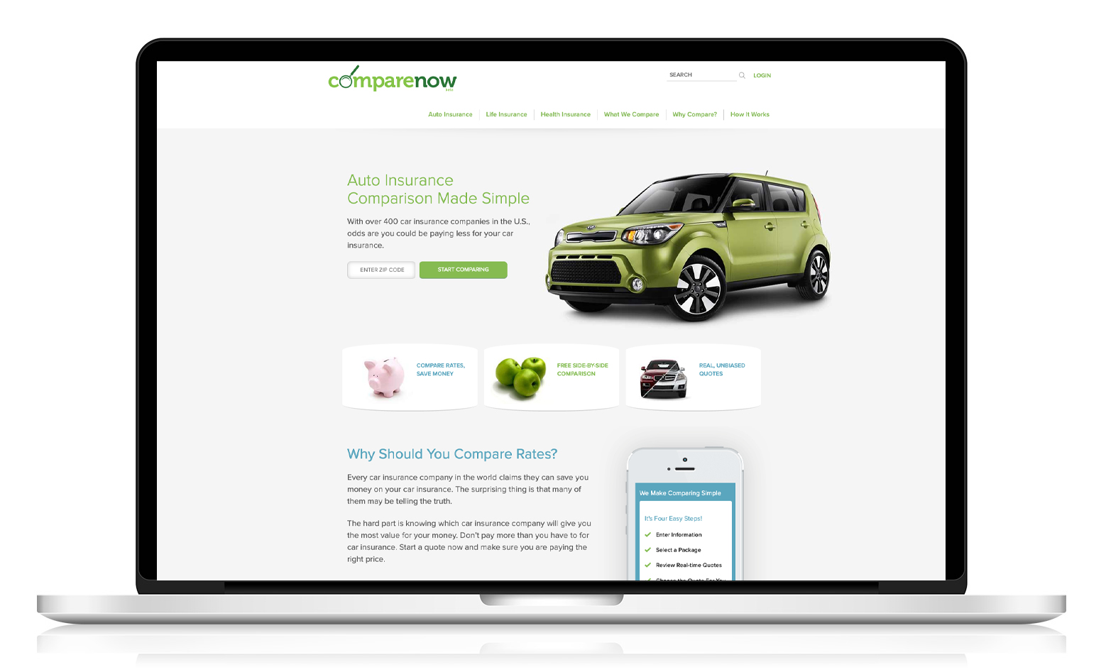
Old Design
The outdated website failed to reflect the company's high-tech, cutting-edge brand identity. Its core purpose was unclear, with users often mistaking it for a used car marketplace or a standalone insurance provider. Additionally, the unappealing color scheme and overuse of clipart diminished its credibility and modern appeal.
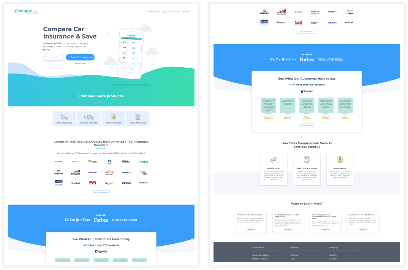
New Design
The new design aimed to reimagine Compare.com's brand to align with its purpose and appeal to its target audience: young professional millennials seeking tailored insurance solutions. The approach included a visual refresh with a brighter color palette, sleek modern icons, and relatable photography. Trust elements, such as customer testimonials and insurance carrier logos, were incorporated to enhance credibility. The goal was to create a stronger connection with the audience while emphasizing Compare.com's value in delivering the best coverage at the best price.
Competitor Analysis
As part of the redesign I conducted some competitor analysis. This process helped identify market trends, customer needs, and gaps our product could fill. By evaluating competitors' strategies, we were able to refine our approach, differentiate our offerings, and strengthen our market position.
Compare.com's value proposition in relation to their competitors was to provide real rates, not estimates.

- Age: 28
- Occupation: Marketing Specialist
- Location: Austin, TX
- Education: Bachelor's Degree in Communications
- Tech Proficiency: High (Comfortable using apps, online tools, and social media platforms daily)
Ashley is a tech-savvy millennial who loves staying in control of her finances. She recently moved to Austin to pursue a new job and enjoys exploring the city with her dog, Luna. Ashley values convenience, transparency, and efficiency when making decisions, especially when it comes to money. She's looking to switch car insurance providers to get the best value for her coverage while balancing her busy lifestyle.
Goals- Quickly find the best car insurance rates for her budget.
- Compare coverage options and perks without hidden surprises.
- Understand how different insurance providers cater to her specific needs as a city driver.
- Overwhelming information and jargon on insurance websites.
- Long quote processes that require too much personal information upfront.
- Not knowing if she's getting a truly competitive rate.
- Uses her smartphone to browse comparison tools and insurance apps.
- Relies heavily on customer reviews and ratings when making decisions.
- Prefers quick, straightforward interactions with minimal friction.
- Save money for upcoming travel and hobbies.
- Feel confident about her insurance decision by choosing a trusted provider.
- Avoid unnecessary stress and wasted time.
- Values mobile-friendly, intuitive interfaces.
- Prefers side-by-side comparison charts and personalized recommendations.
- Seeks clear, upfront pricing and plain-language explanations of coverage.
“I just want to find the best deal without feeling like I'm getting tricked by fine print.”
Personas
To identify and understand our target audience, we developed detailed personas. These personas provide valuable insights into who our product should be marketed to and how we can effectively deliver data that meets their needs.
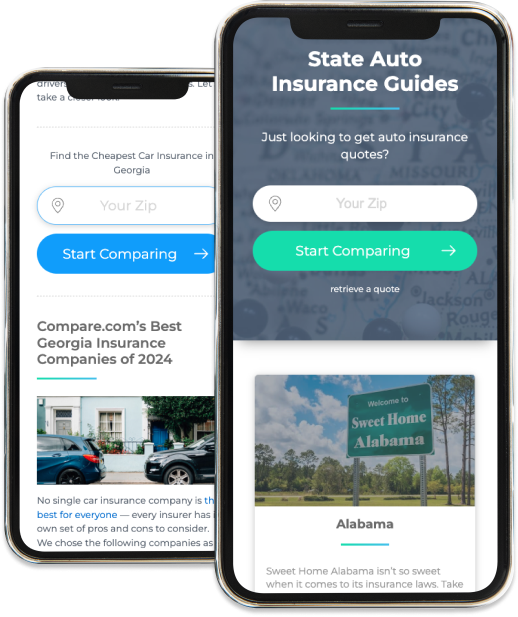
SEO Pages
The goal was to increase natural search traffic and attract the intended audience. The approach included SEO content development, where I collaborated with SEO and marketing teams to research and create keyword-optimized pages. This effort included developing comparison pages for auto insurance by state, vehicle, and company, featuring detailed customer reviews. Additionally, a quote box was designed to allow users to enter their ZIP code and compare rates.
These changes resulted in a:
20% increase in quote starts.
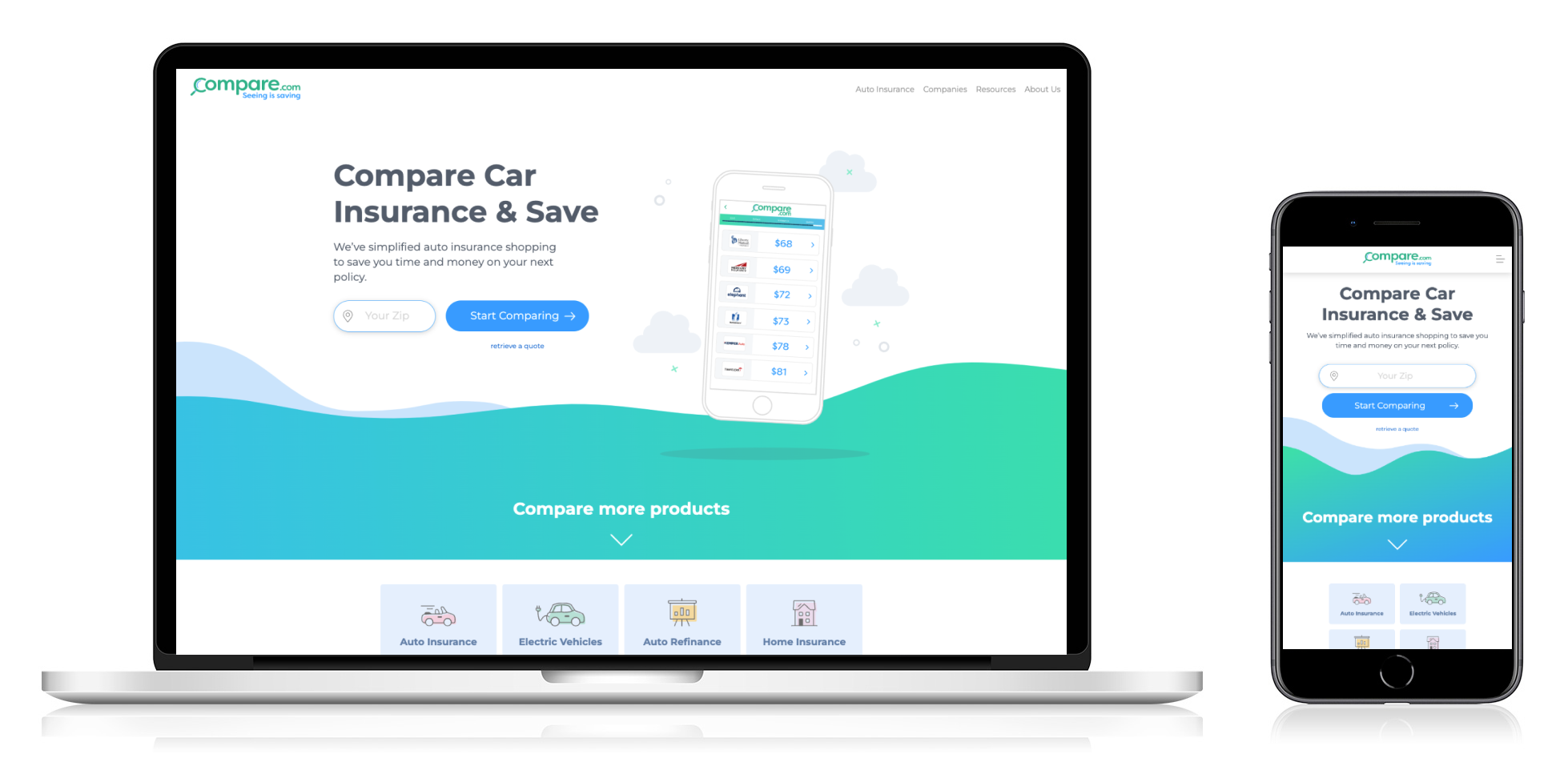
Fully Responsive Layout
Execution is critical to any successful design project. In addition to redesigning the site, I ensured a pixel-perfect implementation, upholding the highest standards of quality and detail. I updated the underlying code to ensure full accessibility, creating an inclusive and compliant experience. The design was also optimized for seamless performance and visual appeal across all screen sizes, delivering a consistent and engaging user journey.
view live websiteConclusion
For this project, it was essential to understand why Compare.com's existing website was failing to convey the desired brand identity. Through extensive user research, testing, and competitor analysis, we identified the need for a modern, engaging design that would resonate with a younger, tech-savvy audience. Our goal was to enable users to easily compare rates from dozens of insurance carriers and find the best auto insurance at the most competitive prices.
Achieving this required multiple iterations—some of which did not meet expectations—but ultimately, we delivered a rebranded marketing website that effectively communicated Compare.com's value proposition. The final design not only provided clear, valuable information about auto insurance but also streamlined the customer journey, helping users confidently discover the best rates for their needs.